Cover Letter with Style - Part Three
- Stefano
- Typesetting
- 03 Apr, 2020
This is the third part of the tutorial Cover letter with style. You can find the second part here.
The header
It’s time to set up a custom header for our cover letter. The default one renders the sender address on the top left part of the letter, but we can change that. I usually put my name and my current job title in the header accordingly to my giant ego. In KOMA-Script, there are several ways to define your header, each offering an increasing degree of freedom and a rising complication in use. Luckily enough, for our purposes, we can use the easiest.
The simplest way to change your header is by setting firsthead variable. That will set the custom header just for the first page of the document. But we’re talking about a cover letter: don’t even think to make it longer than a page. Enough said. I will modify the template now:
1\ProvidesFile{standard.lco}[%2  2002/07/09 v0.9a LaTeX2e unsupported letter-class-option]3
4\usepackage[english]{babel}5\usepackage{fontspec}6
7% ==============================================8%  PERSONAL DATA9% ==============================================10\setkomavar{fromname}{Ambroos Janssen}11\setkomavar{fromaddress}{Van Eeghenlaan 69\\1691qt Amsterdam\\Nederland}12\setkomavar{fromphone}{+31 (0)22 7394203}13\setkomavar{fromemail}{a.janssen@gmail.com}14\setkomavar{fromfax}{+31 (0)71 5144543}15\setkomavar{fromurl}{https://www.kindoblue.nl}16\setkomavar{frombank}{Postbank 9307157}17\setkomavar{place}{Amsterdam}18\setkomavar{signature}{Ambroos Janssen}19
20% ==============================================21% FORMATTING STUFF22% ==============================================23
24% === font settings25\defaultfontfeatures{Mapping=tex-text}26\linespread{1.1}27\setmainfont {Cormorant}[]28\setsansfont [Scale=MatchLowercase]{Fira Sans Book}29
30
31\setkomavar{firsthead}{32      \centering33         \usekomavar{fromname}\\34         Software Architect and Developer35}36
37\endinput
So, I have specified the following: the header shall be centered (line 33) and composed of two lines by using \\, which is the latex command to break the line. On top there will be our name. I didn’t write it directly because it is already set at line 11. So I used \usekomavar to lookup the fromname variable. The second line is the job title. You can choose to define a variable for it if you plan to use the job title more than once in your letter.
Now, render the letter to see the result:
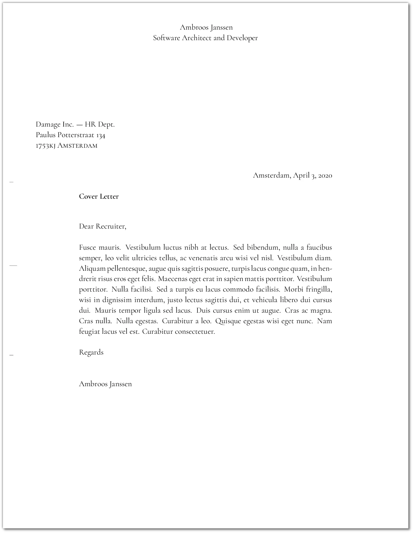
Well, it sucks. But we can improve things, no worries.
Using macros
In Latex, we can use macros to make code reusable. It will also help with the conciseness of code that will use those macros. I will define a macro to give a name to a particular font family used exclusively for the header title. We will be using Cormorant SC, which is the Small Caps version of the main font family. Also, I will define a couple of macros to represent the title and subtitle in the header. Like this:
1\ProvidesFile{standard.lco}[%2  2002/07/09 v0.9a LaTeX2e unsupported letter-class-option]3
4\usepackage[english]{babel}5\usepackage{fontspec}6
7% ==============================================8%  PERSONAL DATA9% ==============================================10\setkomavar{fromname}{Ambroos Janssen}11\setkomavar{fromaddress}{Van Eeghenlaan 69\\1691qt Amsterdam\\Nederland}12\setkomavar{fromphone}{+31 (0)22 7394203}13\setkomavar{fromemail}{a.janssen@gmail.com}14\setkomavar{fromfax}{+31 (0)71 5144543}15\setkomavar{fromurl}{https://www.kindoblue.nl}16\setkomavar{frombank}{Postbank 9307157}17\setkomavar{place}{Amsterdam}18\setkomavar{signature}{Ambroos Janssen}19
20% ==============================================21% FORMATTING STUFF22% ==============================================23
24% === font settings25\defaultfontfeatures{Mapping=tex-text}26\linespread{1.1}27\setmainfont {Cormorant}[]28\setsansfont [Scale=MatchLowercase]{Fira Sans Book}29
30
31\newfontfamily\titlefont{Cormorant SC}32\newcommand\mytitle{\titlefont\usekomavar{fromname}}33\newcommand\subtitle{\titlefont{Software architect and Developer}}34
35\setkomavar{firsthead}{36   \centering37      \begin{tabular}{c}38         \mytitle\\39         \subtitle40      \end{tabular}41}42
43\endinput
At line 31, I use the \newfontfamily to define a new handle representing a font family. In case you want to use the fontspec customization capabilities, we can use them here, in one place only. After line 31, the name titlefont will represent whatever font family and its parameters we chose. At line 32, we define the macro mytitle. It will be our name, this time rendered with the font titlefont. At line 33, we define subtitle in the same manner. The last thing to do is to update the definition of our header by using those macros. The code is more clear now, I hope.
Let’s take a looks a the result: 
Much better. But I’m still not entirely happy. So, I will increase the font size and, more importantly, I will increase the letter spacing, just for the first line.
Exploiting font features
In Latex you have commands to alter the font size:
| normal size -> | 10pt | 11pt | 12pt |
|---|---|---|---|
| \tiny | 5pt | 6pt | 6pt |
| \scriptsize | 7pt | 8pt | 8pt |
| \footnotesize | 8pt | 9pt | 10pt |
| \small | 9pt | 10pt | 11pt |
| \normalsize | 10pt | 11pt | 12pt |
| \large | 12pt | 12pt | 14pt |
| \Large | 14pt | 14pt | 17pt |
| \LARGE | 17pt | 17pt | 20pt |
| \huge | 20pt | 20pt | 25pt |
| \Huge | 25pt | 25pt | 25pt |
So for example if you use the command Large and the normal font size is 10pt, you will get the size of 14pt applied in whatever context the command is applied. So let’s proceed:
1\ProvidesFile{standard.lco}[%2  2002/07/09 v0.9a LaTeX2e unsupported letter-class-option]3
4\usepackage[english]{babel}5\usepackage{fontspec}6
7% ==============================================8%  PERSONAL DATA9% ==============================================10\setkomavar{fromname}{Ambroos Janssen}11\setkomavar{fromaddress}{Van Eeghenlaan 69\\1691qt Amsterdam\\Nederland}12\setkomavar{fromphone}{+31 (0)22 7394203}13\setkomavar{fromemail}{a.janssen@gmail.com}14\setkomavar{fromfax}{+31 (0)71 5144543}15\setkomavar{fromurl}{https://www.kindoblue.nl}16\setkomavar{frombank}{Postbank 9307157}17\setkomavar{place}{Amsterdam}18\setkomavar{signature}{Ambroos Janssen}19
20% ==============================================21% FORMATTING STUFF22% ==============================================23
24% === font settings25\defaultfontfeatures{Mapping=tex-text}26\linespread{1.1}27\setmainfont {Cormorant}[]28\setsansfont [Scale=MatchLowercase]{Fira Sans Book}29
30
31\newfontfamily\titlefont{Cormorant SC}[Scale=1.7]32\newcommand\mytitle{\titlefont\Huge\addfontfeature{LetterSpace=20.0}\usekomavar{fromname}}33\newcommand\subtitle{\titlefont\large{Software architect and Developer}}34
35\setkomavar{firsthead}{36   \centering37      \begin{tabular}{c}38         \mytitle\\[5mm]39         \subtitle40      \end{tabular}41}42
43\endinput
At lines 32 and 33, I used the command large and Huge. Since Huge is still not huge enough for the first line of the header, I also changed entire titlefont scale by using the Scale modifier.
For the titlefont, I also used the command \addfontfeature to set the letterspacing factor equal to 15.0. To find the right number, I just did some experiments. I also set up half a centimeter of space between the lines, with the [5mm] after the \\
So, let’s render the letter again:
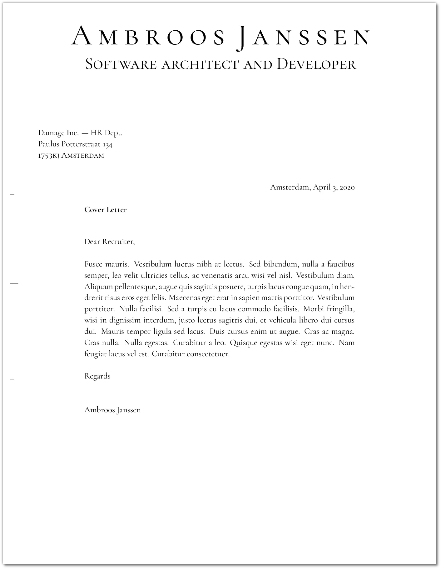
Very nice!
In the fourth part I will show how to setup up the footer, and then we will be ready for the watermarks, logo, and barcode.